Your Basket is currently empty!
History of Pink : And How to Use the Colour Wheel to find Colours that Match Pink
What better colour for summer than a beautiful hot pink?
So how could we resist Pantone’s summer colour “Beetroot Purple” as the shade of inspiration for our latest soaping project.
This hot pink, fuchsia is a knock-out shade boasting cool blue undertones and will add vibrancy to your creations.
Hot pink is such a popular crafting colour, but the colour pink has a “shady” past.
Before we dive into how I chose the other colours for my soap let’s explore the history of pink and its feminine associations.
The colour pink and it’s vivid history
Believe it or not, the colour, pink which we often associate with everything feminine was considered a masculine colour.
If you look at paintings from the 1700s you will find that both boys and girls of the upper classes wore pink.
Because pink is the “child” of “mother” red, it was associated with passion, energy and aggression.
Pink remained a masculine colour right up until the early 20th century until Henry Huntingdon a well-known, railroad magnate purchased two paintings.
Blue Boy & Pinkie – The Paintings that changed the course of history
One was called the Blue Boy (1770), a famous painting by Thomas Gainsborough, depicting a boy dressed in blue.
The other was named Pinkie by Thomas Lawrence (1794). The lively painting shows a young girl dressed head to toe in baby pink, against a sunny, stormy sky.
These two paintings, so famous at the time, are thought to have started the modern gender associations with both blue and pink.
Now we have come full circle and pink can be seen in everyone’s wardrobes. The trick is knowing which colours go well with it .
Finding colours to match pink for your cold process soap and other craft projects – use the colour wheel
The closest pink to match Pantone’s Beetroot Purple has to be Pink Blue synthetic mica powder.
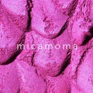
It’s a powerful pink with exceptional brightness.
Because it is a synthetic mica pigment it creates a very clean and crisp final colour in your crafting projects.
To help us find some great colour choices to match our hot pink, we can use guidance from the colour wheel.
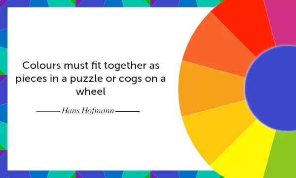
The colour wheel is a great place to start when deciding on a colour palette.
The first step is to find a shade on the colour wheel that is closest to your base colour.
For me that was pink, which can be found between red and purple on the colour wheel.
Then you can work out the following colour matching options by using the four colour groups below –
Complementary colours – The colours directly opposite one another.
Split complementary colours – The colours adjacent to the complementary colour.
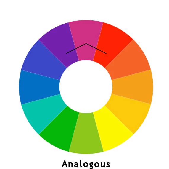
Analogous colours – Groups of colours that are next to each other on the colour wheel.
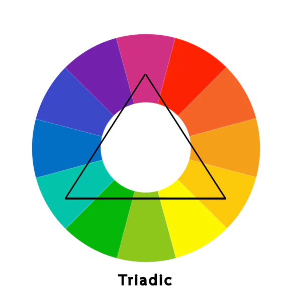
Triadic colours – A selection of three colours which are the same distance from one another on the colour wheel.
When we approximate Beetroot Purple to pink on the colour wheel, we are able to see it’s best colour matches.
Using pink as my starting colour, I was able to locate its
-split complementary colours – green and yellow
-analogous – red and purple
-triadic colours – turquoise green and a dark sunset yellow
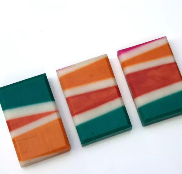
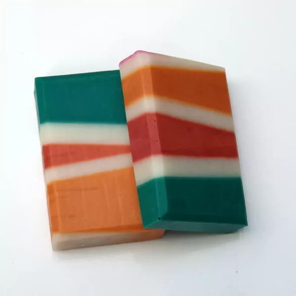
For this geometric soap project I decided to combine split complementary, triadic and analogous colour options all together to arrive at my colour palette.
Then there was a little more improvisation after that ;).
The final colours choices were –
orange,
green and
white to help with contrast.
Orange as you can see is not directly one of the analogous colours but it’s very close.
Because this shade of pink is quite bright, I didn’t want to over use it and decided to pick 2 orange shades to go with it.
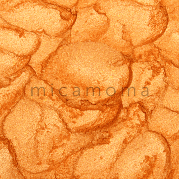
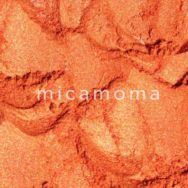
Apricot Orange mica powder is light and peachy, while Mandarin synthetic mica powder is a deep russet orange.
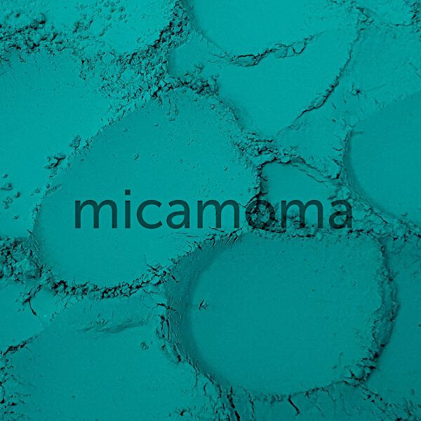
Hydrated chromium oxide is a beautiful go-to shade for me. As green turned out to be a triad colour, this turquoise pigment seemed to go well with the colour scheme.
The splashes of white intersecting lines help to show each colour off and add balance to the design.
Overall I wanted to capture the mood of summer with pink and orange sunset skies and a lush green shade to symbolise new growth.
What do you think of the final result? Let us know in the comments.
You can use this technique for any crafting project to help you pick a colour palette.
But please feel free to break the rules. As long as colours look good together, then they match each other.
Thank you for reading. If you found this article helpful please comment or drop us a line, we would love to hear from you 🙂


